Dashboard “Mayhem” and Radio
Do you sometimes get the feeling at work that you’re on a merry-go-round, putting out the same fires, dealing with the same issues and problems? When it comes to the car dashboard, that’s the way it feels sometimes. Just back from CES last month, our heads and still spinning with the latest and greatest infotainment systems made by car companies all over the world. Sure, the dashboards are getting bigger, loaded with more content, like virtual meeting software and videogames to pass the time while those EVs are getting charged back up.
But are they any easier or safer to use? In the latest Mercedes-Benz TV ad – “Defining Class Since 1886” – suave pitchman Matthew Macfadyen (“Succession”) walks us through the experience, including through a test lab featuring their Hyperscreens, their pillar-to-pillar dashboard concept we’ve been showing you since 2021 when it made its debut. It is beautiful, eye-catching (distracting?), and teeming with options for the driver and her passengers.
I’m now driving a Lexus FX-350 and I’m here to tell you it has one of the worst dashboard UX’s I’ve ever seen – and I’ve driven some bad ones. I have had some close calls trying to get this infotainment system – often with a mind of its own – to do what it’s supposed to do. The interface with Apple CarPlay is also inconsistent – not an experience I’d wish on any of you.
So when I bumped into this post that’s exactly seven years old, it struck me how many of the same issues remain. In thinking about driver distraction, I don’t think metadata or changing radio stations is the problem. Mediocre dashboard interfaces are still not standardized so there’s a learning curve every time you hop in the driver’s seat of a car you’ve never driven before.
And of course, most people are still driving around with a smartphone in their hands. If these infotainment systems were doing their jobs, we wouldn’t feel compelled to grab the phone in order to get it to behave properly.
I also noted that Roger Lanctot and Chris Schreiner – prominently featured in this post – are still at it. Their new company is TechInsights, but they are still trying to help us untangle the crazy web of media and technology in our dashboards. If anything, interfaces and capabilities have only grown since I wrote this post. But as for their ability to respond to our needs using our voices rather than our eyes and fingers, it is still very much lacking.
Mayhem. – FJ
February 2017
The last decade has been an important one for the auto industry. And we’re not just talking about the recession that nearly put General Motors and Chrysler out of business.
Consider that just ten years ago, it would have been illogical to see automakers at an event like CES. After all, what did cars have to do with the consumer electronics industry, the realm of brands like Microsoft, Intel, and Samsung?
But as technology began to transform the dashboard, the landscape of media and entertainment in cars changed with it. Ford’s SYNC platform was the early pioneer in the space, preceded by GM’s On-Star, which back in the day was an emergency services tool. You contacted On-Star when you were locked out of your car. You punched up SYNC when you paired your phone or started using embedded apps on your touchscreen.
The Ford SYNC system in the early years was rugged, eventually paving the way for smoother, more intuitive driver experiences. SYNC’s voice command system was crude, often frustrating consumers. At the NAB Radio Show a few years back, Strategy Analytics’ Roger Lanctot played a video of a first-time SYNC user struggling to perform a simple voice command task: tuning in a radio station. As someone who bought a Ford with one of the early SYNC systems, I could relate.
It hurt Ford in those all-important J.D. Power ratings. Dashboard complaints brought Ford’s numbers down year after year. As many in the automotive industry quietly noted, “Ford took one for the team.” By being first in the space, they paid the price, while helping other automakers – OEMs – figure out the space.
At last week’s NABA Symposium in Washington, D.C., Roger was once again on stage, playing updated videos showing an improved dashboard user experience, but still pointing out some of the same nagging interface problems that persist.
And to put a point on that, there’s a new “Mayhem” commercial for Allstate that makes the “connected car” look like technology that could kill us at the next intersection. For automakers, this is their worst nightmare.
But the reality is that the dashboard user experience – or UX – is gradually changing for the better. Ford has led the way with SYNC 3, a simplified, intuitive interface with clear labels that even the most technophobe drivers can handle. And I’ve noticed in car rentals over the past year or so, the interface is generally more intuitive. In many cases, it’s become easy to pair my phone, tune in my client station (and the competition), and preset them all before I leave the rent-a-car lot.
At that same NABA Symposium, Audi’s Manager of Connected Vehicles, Anupam (Pom) Malhotra, told the audience, “I want to give my customer all the options in an easy to use interface. Listen to what you want when you want.” And more and more, that’s what consumers are demanding.
As the Allstate commercial suggests, part of the safety issue in new cars revolves around touch screen distraction. But as Pom reminded the room, whether you’re a fan of knobs or not, carmakers are fixated on Millennials – young consumers who have grown up with touch screens – and no buttons.
And he listed the four biggest trends in the auto industry, and they all have implications for radio:
- Connectivity
- Electrification
- Shared mobility
- Automation
Roger’s company, Strategy Analytics, has documented the importance of that trend at the top of his list – connectivity – whether it creates mayhem or not:
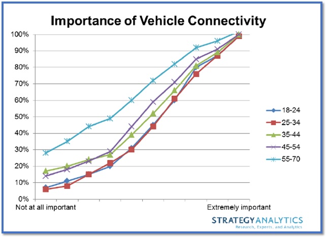
It’s fascinating that just about everyone values automotive connectivity – but at what price?
Creating a safer and less frustrating experience has truly been the focus of every automaker, as well as Tier 1 companies like Panasonic, Pioneer, and Visteon – all of whom we spent time with at CES.
Roger’s take on the dashboard experience is that “it’s getting better, easier – while simultaneously more complex…It’s a vast experiment with some small successes here and there.”
His colleague, Chris Schreiner, director of User Experience Practice, also notes that it’s often one step forward and one step back:
“Yes, it is getting better…but as always there is still a way to go. It’s always an internal struggle within OEMs between those that understand how to optimize the consumer experience and those that favor style and visual design.”
And as for dashboard danger, Roger offers up a different way to think about the interface:
“Glance time is the new metric. The old-fashioned radio gave you no reason to glance – that is the benchmark.”
Mayhem indeed.
